Decoding Art
Posted by Brian Kelly on 10th January 2011
About this Guest Post
Martin Grimes is the Web Manager for Manchester City Galleries. He can be contacted at m.grimes@manchester.gov.uk
Decoding Art: Delivering interpretation about public artworks to mobiles
What’s that weird blocky thing?
A little over two years ago independent consultant Julian Tomlin worked with Manchester Art Gallery to trial the use of QR codes to deliver interpretive content about six objects in the gallery’s Revealing Histories: Remembering Slavery trail.
Large QR code labels were placed beside the object labels and each of these linked to a specially created web page which had further text information and in some cases an audio clip about the object. A guide leaflet was produced and Visitor Service staff were briefed about the pilot – mainly so they could answer the frequent question, ‘What’s that weird blocky thing?‘
There’s little doubt that this pilot was ahead of the curve in terms of public recognition of QR codes in the UK and it’s difficult to say for sure how many of the visits to the web pages were made by gallery visitors and how many were made via links on the technology sites that reviewed the pilot.
Fast-forward two years and the landscape has changed significantly, QR codes are becoming almost mainstream in the UK. With this awareness in mind, at the beginning of this year we re-visited the use of QR codes as a means of delivering interpretive content to mobile phones, but this time out in the public spaces of the city. Building on the work done by gallery placement student Marek Pilny, which used Google Maps to mark the geographical location of most of the public artworks in Manchester Art Gallery’s care (http://www.manchestergalleries.org/the-collections/public-art/) we again worked with Julian Tomlin to investigate how we might use QR codes or other location based technologies to deliver interpretative material to people’s mobile phones as they came across artworks in the city.
Decoding Art
We embarked on a pilot that aimed to discover:
- Whether QR codes are a viable method to do this
- What the practical and technical issues might be
- How existing online content might need to be adapted or developed
- Whether new forms of content – audio for instance – are feasible
- What the take-up will be – are QR codes recognised by a wider public, what content types are most effective?
- How we can enable users to feedback or contribute to the content
Julian conducted research that looked at QR code origination methods, symbol versions, optimum label size, performance of the labels at different locations on the works and in different light levels and label fabrication options. We also did some limited testing with a number of mobile phones with different screen sizes and different operating systems.
Testing also included looking closely at two methods of mounting the labels, adhesion and physical fixing. Each work in the pilot had a unique base and had different types of inscription or information panels, so finding an approach that would work across all has been perhaps the most difficult and time-consuming aspect of the project, involving extensive testing by a conservator and significant consultation with city planning officers.
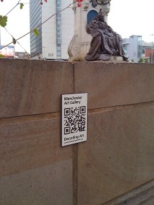
In some situations it has not been possible to find a suitable mounting point on the work itself so other nearby surfaces have been used. Though we don’t have enough data yet, it seems very likely that people will not immediately see the connection between work and label and this may impact on visits.
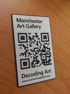
Research into suitable materials from which to fabricate the QR labels had to consider that this project was a pilot, so along with aesthetic and effectiveness considerations, cost and permanence were key issues. After considering many options including laser-cut or etched and coloured stainless steel we settled on Traffolyte, a multi layered phenolic plastic which is used to make name badges, signs and labels. The QR code, gallery logo and project title have been laser-etched into the top layer and as objects in themselves they are quite beautiful.
Whilst the research and testing was under way, Beth Courtney, a conservator at the gallery, took the rather dry documentation content that we already had and re-scripted it to suit a mobile-using audience. Instead of listing basic facts and details about the work, Beth divided the content into a series of slightly offbeat and quirky questions or facts and presented just a sentence or two of further detail beneath:
Why does she look so grumpy?
I think the sculptor was probably aiming for stately, but she does look a bit grumpy. For much of her reign Victoria was rather a sad figure because she never recovered from the sudden death of Prince Albert when she was in her early forties. She wore black for the rest of her long life as a sign of mourning for him.
Manchester historian, writer, broadcaster and Blue Badge Guide Jonathan Schofield also recorded two minute reflections on 12 of the works. His approach was similarly quirky, informed but thoroughly engaging and not a little opinionated.
Following further research and costed options from developers, we decided to build and host a website to host the content ourselves using WordPress. We used the Manifest 1.01 theme as it was unfussy, clean and streamlined and the WordPress Mobile Pack plugin (http://wordpress.org/extend/plugins/wordpress-mobile-pack/) to help us deliver readable content to the widest range of mobile phones.
Sticky backed plastic
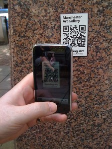
Ongoing issues around the fixing of the QR labels to the works – especially to those with listed building status – eventually lead to a decision to proceed with temporary vinyl labels. The labels were trailed in June and July and we informally launched the pilot at the beginning of August. As well as the QR code, the labels included short code URLs for those users who didn’t have a QR reader installed.
The project had received some advance publicity from Visit Manchester and at the point of launch was promoted through twitter, facebook, our email newsletters and a Manchester City Council email newsletter. As expected, following each promotion, the visit figures increased a little, often though, this was to the desk-top version of the site. A mobile analytics package from Percent Mobile enables us to differentiate between desktop and in-the-street mobile use.
Have we learned anything yet?
We’ve learned that more people than we imagined do know what QR codes are and how to use them. The maximum visits in one day so far were 32 with the daily average being 4.3. We’ve learned that visits go up at weekends and that they go down when people peel off the labels. Currently we have to re-label works in some high traffic areas every two weeks.
Works that are clearly labelled at a reasonable height off the ground and which face high traffic walkways also get more visits. The Christmas Markets which surround 6 works in the pilot have also blocked access to the codes and this has impacted upon visit numbers.
In terms of devices, the iPhone heads the pack followed by the Blackberry 8520, HTC Desire and HTC Nexus One. In detail, we’ve seen:
- 39 Devices
- 98.7% WiFi Capable
- 77.5% Touchscreen
- 23.5% Full keyboard
- It’s all about the content
We’ve had some very positive feedback about the interpretive content via twitter, and other equally positive anecdotal feedback. Each work description has a comment option but we’ve not had any responses through these yet. Formal online and offline evaluation will take place early in the new year with the aim of reviewing the technologies and the content. From the feedback so far we think we’ve judged the content well, but we do need qualitative evaluation to confirm this. We are also aware that, despite it’s unfussy and quirky tone, it is still the museum offering interpretation, one or two voices, uni-directional, still didactic. Nancy Proctor , in issue 5 of Museum Identity [1], discusses the idea of the distributed network as a “[...] metaphor to describe new ways of authoring and supporting museum experiences that are:
- conversational rather than unilateral
- engaging rather than simply didactic
- generative of content and open-ended rather than finite and closed“
Decoding Art does, we think, engage with the first two of these points, but it is the third that we’d like to explore further and there are already ideas in place about how we might do this.
The desktop version of Decoding Art can be found here: http://www.manchestergalleries.org/decodingart/
If you’re in the city with your mobile phone, see if you can spot any of the works included in the pilot and let us know what you think.
Reference
- Nancy Proctor, 2010, The Museum As Distributed Network, p48, Museum Identity, Issue 5.
Posted in Evaluation, Museums, QR-codes, Technical, Web 2.0 | 2 Comments »


